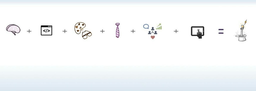
I am not a huge fan of LinkedIn’s cover image. Its an odd-sized banner that gets overridden by ads and the profile header itself. The flip-side of not having one is that it makes your profile look very lame. After all, a picture is worth a thousand words.
A couple of iterations later, I put up a metaphor of my professional side as the cover image. What do you make out of it? I’d love to hear in the comments section.

