Category Archives: Product

Figjam, the Red ocean of Whiteboards & a Jobs-to-be-done-based Strategy for Growth 🚀

A couple of weeks back, I was mentoring a startup around their product’s value metric and went on to check subscriptions for a few products. On Figma’s price page, their brand new white board solution – Figjam – was a click away!

What I liked ❀

  • Simplicity for focus: Limited tools on an infinite canvas, distraction-free (on-demand) editing and quick load times are great to capture ideas quickly & organise visually. This was a pleasant break from Miro & Figma itself that do so much more and inadvertently draw your attention to presentation. I could also do some very basic mobile wireframes.
  • Drawing made easy: In office, I was a heavy pen & board user. To continue quick drawing in my remote setup, I bought the cheapest Wacom tablet and used it with Sketchbook and Jamboard. Miro’s palm rejection is a bit messy. Figjam was smooth like butter – both for writing and drawing shapes. You can’t draw auto-shapes like Miro, Figma’s vector network features are not available yet. But  you also can’t fill them up with color like in MS Paint 🙂
  • Emojis have the place they deserve: Figjam has a cool emoji palette making it easy to drop quick reactions all over the board. Social rewards mean even more in remote work and I love these as they drive recognition, confirmation and healthy competition between the participants. Though some Emojis don’t show up. Miro launched a less in-the-face version early May. 

What I missed 💔

  • Stronger mind mapping: I adopted Mindmaps before onscreen sticky notes and LucidChart. While Figjam makes it easy to fork linear nodes, it doesn’t support one-to-many out-of-the-box.
  • Alternate Funky font: No, I don’t use ComicSans in business, but from time-to-time I love to create visual relief using an alt font — especially for comments and cues. Two fonts, like Miro offers, is enough.
  • Hyperlinking: Sure, I can live without that font. But in a world where everything from a lesson to a payment request is a URL, not being able to CMD+K a node sucks.
  • No export options yet: Honestly, not a deal breaker since you can copy all objects to Figma and export from there.

Why Figma launched FigJam

  • Support a new use case: Most designers I know capture everything from early sketches (even if photos) to mocks to prototypes and eventually design assets in Figma. But for anyone else to collaborate, it requires an editor license, which disincentives use and slows down its bottom-up sales strategy.
  • Expand audience: Figma’s vector objects, layout and preview features are too hard for thinkers beyond trained designers. Its value is driven by sharing & editors and more users can’t be added without new PMF. The world has over a billion knowledge workers suddenly deprived of whiteboards. This tool is perfect to capture adjacent users, sell more licenses and collect the SSO tax (the key differentiating feature in that plan).
  • Performance & costs to serve: This is just my hypotheses. Given current loads, all whiteboards suffer performance issues. Repackaging the feature set to serve that expanded audience with a simpler interface, better performance, and potentially lower infrastructure costs is smart.
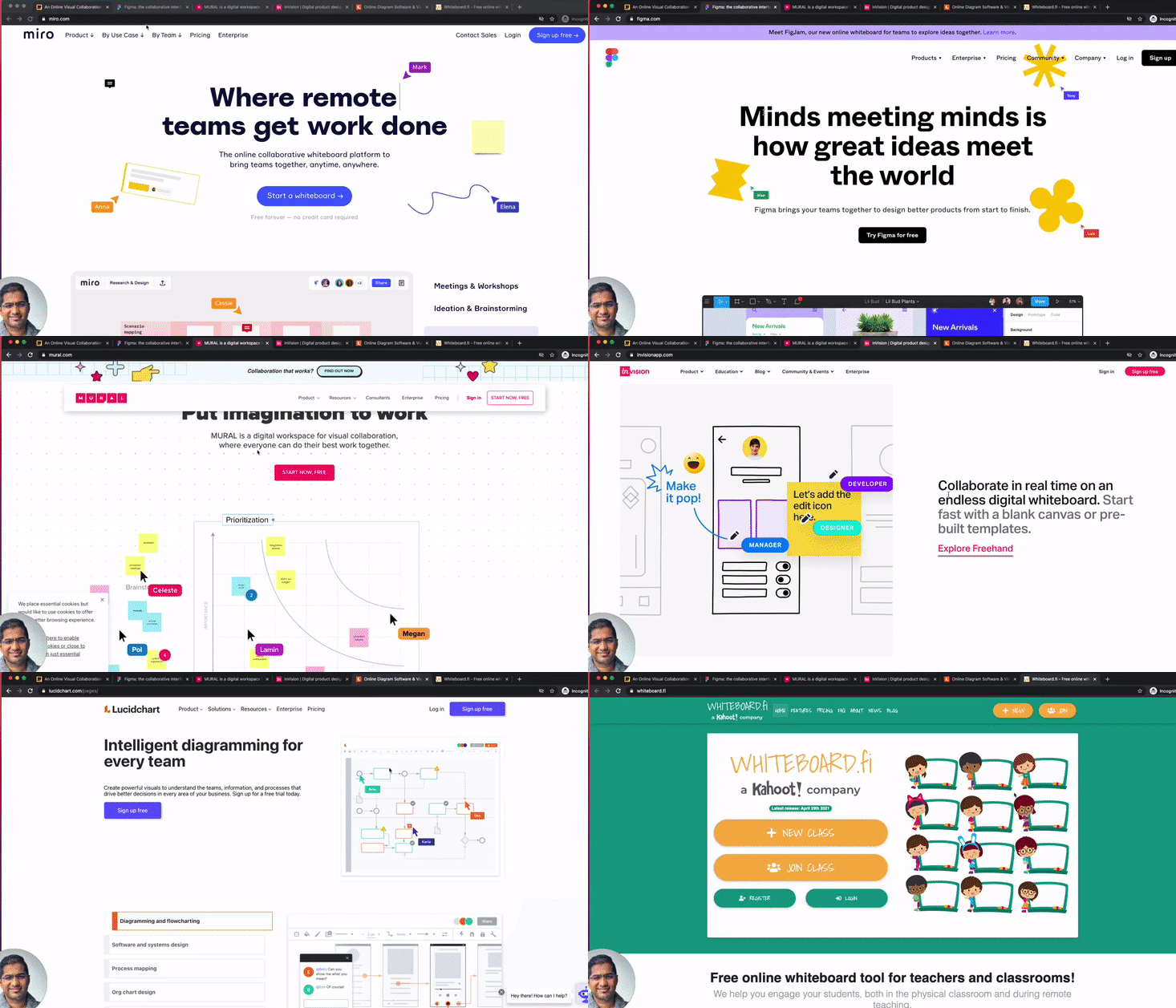
Just see how similar the landing pages for all these products look! Thank God Whiteboard.fi chose a different background color.

What this means for Miro, Mural, Invision & Lucidchart’s strategy

Given the exponential growth driven by remote, it’s no surprise that all 5 ended up in the red ocean of whiteboard collaboration and started looking same the same.

With that said, they all come from a different core use-case and history, and survival depends on picking and sustaining with a mix of the below strategies:
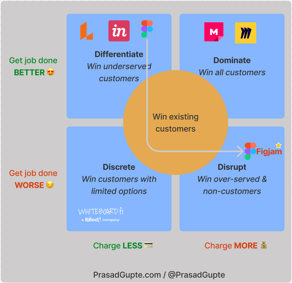
Logos are the properties of the respective companies and only used for illustration. Inspired by Tony Ulwick’s matrix.

  1. Differentiated strategy: stay highly differentiated in that core use. The veterans — Invision, Figma and LucidChart are very strong at Product design and diagramming.
  2. Dominant strategy: build something that works for everyone and try to become the new “workspace”. Miro with its product-led growth strategy and solid integrations via cards aims to win here. The biggest advantage here is you can expand the market – you can create more visual thinkers, but you can’t create more designers.
  3. Disruptive strategy: disrupt dominant players (or yourself) by simplifying the product and and add adjacent use cases for non-consumers. Figjam does that and will hopefully charge less for adjacent users, but uses current customer base to expand.
  4. Discrete strategy: Leverage defensible constraints like security features, lock-in, bundled sales – the Microsoft strategy to keep customers. I’m sure Pharma’s won’t be happy to see their scientists use one of these tools to brainstorm the COVID vaccine. Whiteboard.fi remains focussed on teachers (Kahoot! acquired them).

What would you do differently?
How to accelerate Customer Impact thru Discovery đŸ€© without the framework hype 😅

Too many teams miss out on unlocking product value (plus fun & learning as bonus) either by not focusing on discovery, or obsessing about the process. Worst is when leaders track efficiency metrics to manage it. Having learned discovery the hard way myself (credits at the end), I think I understand why. But more importantly, I want to share 3 areas leaders can manage instead, so teams are empowered to do their job.

I’d like to start by reflecting on two quotes that explain discovery best.

“Discovery, by definition, means you don’t know the answer when you start.”

Ed Catmull’s (Co-founder, Pixar) spirit1 in Marty Cagan’s words2. Either way, two great influencers on building lovable products.

The most magnificent thing takes a while to build.

Moral of Ashley Spires’ story, The Most Magnificent Thing, for pre-schoolers captures the ups & downs of the creative process perfectly.

There are two unknowns in there: scope (resources) & time — presuming everyone likes high quality. And Management 101 teaches leaders to fear & control both. Rightly so, because they have opportunity costs associated, making leaders and teams anxious about discovery. Instead of trying to observe what works and what to fix, they resort to a shinier process for a false sense of control. đŸ€ŠđŸœ

Don’t get me wrong about process; I love process as a guard-rail but not as the only rail.

Instead if leaders just observed these 3 areas from a distance, they would know exactly where to coach, while empowering teams to have a fulfilling time doing discovery.

1. Origin of discovery work

Understand 🔍

  • How do teams explain ‘discovery’ and their current process? Particularly useful when starting in a new role, and helps understand the mindset, frameworks and approach of the team.
  • What triggers discovery and where does it begin? Answers would most likely range between ticket, feature, idea, problem and mission. Great teams (with a well-defined purpose) are at the right-end of that scale — both literally and metaphorically.

Improve 💡

  • Democratise access to data – both quantitative and qualitative. Data Analysts should be reserved for higher-order analysis that modern-day product analytics and data visualisation tools are still not ready for. User research findings should also be in an easy to search system4. Same goes for customer service tickets and feature requests.

Data accessibility ensures product teams know just as much as anyone else in the company about what their customers need and don’t need to be thrown ideas at.

  • Educate the team on core discovery concepts: dual-track Agile, design thinking, customer journeys, jobs-to-be-done, design sprints. Instead of adopting one as-is, retrospect and restore the missing pieces in your process. Don’t be shy to repeat.
  • Guide teams to clear missions which help them understand which problems to own, and which ones to solve with other mission teams. Assuming good team topology exists. Connect to company mission.
  • Challenge teams on their opportunity(-solution) trees and discuss how those bets fit within the portfolio of bets you manage in your product area. Connect to north star metric through KPIs these opportunities impact.
  • Reflect on discovery content you discover — frameworks, blogs, podcasts, etc — to draw parallels to your process and control the FOMO. Trust me, they all rinse-and-repackage the same core principles.
Continue reading How to accelerate Customer Impact thru Discovery đŸ€© without the framework hype 😅

I learned Ideo’s secret to innovate & design for human emotions 🔼

Part of the reason I love being in product is how success is directly tied to identifying and solving the right problems. Of course this requires sifting through data, but numbers are useless if you can’t contextualize them. And that requires empathy — for customers, for people that work with you, and our eco-system. My colleague John is great at this, and my first port of call to confirm if this course was a meaningful investment to get better at my craft. Thanks for your nod, John.

The Insights for Innovation course from Ideo is spaced over 5 weeks. Primarily online learning, it has continuous collaboration with other learners, and weekly mentor calls. Don’t expect tons of theory as its designed to be application-first. Isn’t learning by doing is the best? Here’s what I learned:

#1 Don’t let your design marginalise minorities.

An idealistic statement that’s weightier now then ever. As builders, we fail to realise that equity can be built into good design. If we did, it wouldn’t take a revolution for product packaging to drop racial references. Pause for a bit and imagine thinking about eating habits when designing a product for a healthy lifestyle. Who did you think of?

Did you those consider humans that work in hazardous work environments like mining, or those that don’t have enough access to daily nutrition? To contextualise the latter, the addressable market for that problem is close to a billion people.

#2 Study extremes even if you only build for core users.

PMs shouldn’t come across like this when advocating for their extremes users.

Customer advocacy is expected of product people. But too often personas limit our thinking with an averaged description of our majority users. Extremes are humans whose needs and environment varies drastically from the typical user or use case. Addressing edge case scenarios expands the range of your solution – not the job to be done. Extremes amplify every other user’s needs, stretching our thinking to come up with breakthrough ideas that expand the range your product serves.

In hindsight, this is how we innovated procure-to-pay at Zycus in 2010. We bet that insights from early (SMB) adopters would help us build for the majority and cross the chasm where most products fall through. PS: If you haven’t read Crossing the Chasm by Geoffrey Moore, please do. One exercise in the course prompted thinking about extreme experiences one could have in a vehicle. What comes to mind? Some extreme ideas at the end âŹ‡ïž.

Continue reading I learned Ideo’s secret to innovate & design for human emotions 🔼

Will your career growth survive COVID-19? 5 prompts to set personal goals today!

I hope you are safe and doing well through the ongoing health and humanitarian crises. The Coronavirus pandemic caught us by surprise, and has left us between repealed norms and an uncertain future. The end isn’t imminent but we’re optimistic.

If you work on the front lines or in an essential category serving this pandemic, my sincere appreciation. Thanks & God bless you. đŸ™đŸ»

If not, you probably have a story for your career-from-home in 2020. And that’s going to be my favorite conversation starter for learning, coaching, networking, interviewing and small-talk in 2021. How did you prevent your personal development from stalling? If you don’t an answer ready, this post might give you some ideas.

In May, Janus offered me to host a session at his Product Management peer group. I took the opportunity to dive into this question with fellow Product leaders and get inspired by their stories from these troubled times. I want to share the leading questions I used (#5 added later) to help frame that story.

Prompts to set personal development goals đŸ€”

  1. What is the 1 thing you had/knew pre-COVID, but didn’t use it much, and are now using/applying it more than before.
  2. What Skill(s) or Technique(s) you learned pre-COVID are you applying right now?
  3. What book kept you inspired during COVID?
  4. What’s a Skill or Technique you want to sharpen in 2020?
  5. How did you give back to the community during these times?
Continue reading Will your career growth survive COVID-19? 5 prompts to set personal goals today!

Our Android app for LandmarkShops India

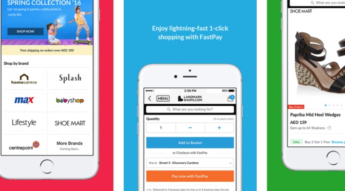
I’m so excited to talk about the brand new native experience we delivered to our LandmarkShops customers in India. And even so because it sports Google’s latest visual language — Material Design!  Read on at our official Medium blog.

LAUNCH: Our latest Android app for LandmarkShops India – Web Team @ Landmark Group

We’re thrilled to tell you that we’ve just launched a shiny new app for LandmarkShops India, using Google’s latest visual language - Material Design and I’d love to tell you more about it! Game of phones Earlier this month, IDC confirmed that Android’s dominance of the global smartphone market is expected to grow further, from 81% to 84% in 2016.

As part of the Landmark Group’s Web Team and my Product Management portfolio includes leading digital engagement channels for Shukran – web, mobile, in-store engagement – and mobile apps for LandmarkShops in UAE & India. More on LinkedIn

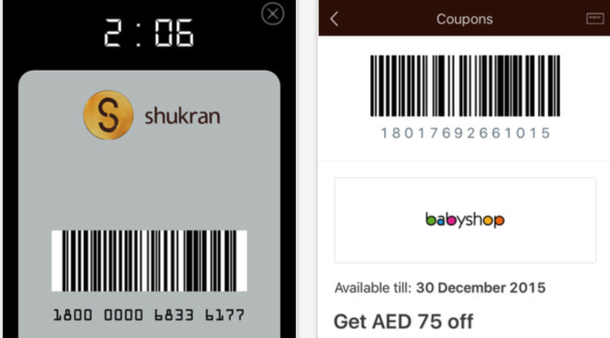
The award-winning Shukran Virtual Card is here!

Its hard to live in the Middle East and not know about Shukran. After all, its the largest retail loyalty program in the Middle East & North Africa, and I’m proud to lead the program’s digital initiatives.

With 15 million members across 10 countries, thinking about scale has become a habit. And here’s how we solved the problem our members forgetting to carry their Shukran card or discount coupons. Read more about the launch at the Web Team’s Official Blog.

[Update 24-Jun-2016] The Shukran app’s very first time at The Loyalty Magazine Awards won us runner-up position in 2 categories:  Best User Experience and Best Coupons Programme. Couldn’t be happier!

LAUNCH: The digital version of your Shukran card & coupons! – Web Team @ Landmark Group

As a Web Team, we strive to deliver an awesome shopping experience for our customers and the last thing we want is for our members to miss out on a discount, or not be able to spend Shukrans when they’re not carrying their Shukran card.

Best User Experience mention

Continue reading The award-winning Shukran Virtual Card is here!

LandmarkShops now has an iPhone app!

Earlier this year, I became part of the Landmark Group’s Web Team, based out of Dubai. The team that started off being the digital custodian for group companies, is now leading the eCommerce and Omni-channel initiatives for the largest retail group in the region.

We’ve had our Android & iPad apps for a while now and for the last few months, we’ve been working on a brand new design that we’re rolling out through a brand new app for the iPhone. I had the opportunity to directly work with Savitar, our Business Head and Creative Director. With him involved, there was a ton to learn right from user experience to writing this blog post. Read more at the Web Team’s Official Blog.

LAUNCH: The official LandmarkShops iPhone app! – Web Team @ Landmark Group

It’s been an exciting time here at LandmarkShops. Over the course of the last year, we’ve worked hard to deliver a true Omni-Channel experience to our customers. We know how much our users love to shop on their mobile devices with our iPad and Android apps.

This week, I’ve had major releases for all products in my portfolio: the LandmarkShops iPhone app, a CMS-powered  LandmarkRewards.in for our 7 million strong loyalty program in India, and an update to the Shukran Android & iOS apps. That’s a lot of action in just 6 months since I joined. I’m relieved and off to a  vacation!

I am part of the Landmark Group’s Web Team and my Product Management portfolio includes leading mobile apps for LandmarkShops in UAE & India, and all digital engagement channels for Shukran – web, mobile, in-store engagement. More on LinkedIn

#RELOOKUP – Rationalizing Housing’s emotional appeal

Ever since I’ve had a wifemy only one – from the advertising arena, I’ve developed a keen eye for commercials & hoardings. If you’ve been in Mumbai in the last month or so, there is no way you have missed the myriad of Housing.com banners extending for miles. Touching emotions is the magic bullet to successful campaigns in the Indian market. Housing did just that, and I feel it succeeded. But when I visited the portal, I felt it lacked the means to realize the dreams the hoardings had shown me, albeit a slick user interface.

Here is what I thought would’ve helped kick-start the #LOOKUP journey and rationalize the emotional appeal.

See nothing? View the presentation on SlideShare
Header image: Sharad Madiman / Gaurav Prakash


3 reasons for e-commerce to go mobile-only

A couple of weeks back, Myntra announced it was closing its web-shop to focus on a mobile-only strategy. With Myntra’s app-based sales already at 60%, it is now aiming at 90%. Soon after, its parent and India’s largest e-commerce site, Flipkart, confirmed similar plans for the next year. Why are  eCommerce giants moving from a mobile-first to mobile-only strategy? Here are the top reasons for having users on the mobile platform – all of which directly impact the bottom line.

1. Customer acquisition & retention

With penetration in India expected to reach 45% by 2020, mobile-only is a flawless strategy to tap into the next generation of eShoppers. A single page m-site is enough to redirect (or force) users to move the existing user base to an app. Comparing products across individual apps is painful. Unless someone comes up with a comparison app, that can launch individual apps for detail, users are likely to stick to a single app. Achieving such a mindshare and stickiness is much harder to do on the web.

2. Insight for direct marketing

Once an app is installed, keeping track of consumer behaviour – usage, shopping times, interests, conversion, etc – is very easy. With registered users, additional demographic information is available which together with predictive analysis can be used to generate personalized suggestions. Push notifications allow strong, direct interaction with the user. In addition to suggestions, it can be used to communicate offers and remind inactive users of abandoned carts, without the fear of getting stuck in spam folders. With direct access to the user, spend on ads & affiliate marketing can be reduced, which otherwise shrinks margins by 8-20%.

3. Cost savings & increased sales

Once developed, apps are cheaper to maintain and can scale faster than the web front and avoid  scaling issues like with the Big Flipkart sale. It also helps deliver better user experiences, optimized to generate sales. With users connected 24×7 via mobile, apps allow users to shop on-the-go. It also makes bundling, up-selling, cross-selling, and generating repeat business much easier. Direct access to users saves 8-20% of margins otherwise lost on ads & affiliate marketing, driving the customer retention cost to a minimum.