Aditi had done her bit of making our wedding cool by getting me to do a pre-wed photo shoot – that turned out awesome thanks to Frames of Mind. It was my turn and I had to prove to the lady (who had agreed to risk her life with me) that as a Product Manager I was creative enough, and thought of surprising her with our own “wedsite”. When the question of build-or-buy came up, I couldn’t find anything that matched my needs and the flexibility I needed to fiddle with it. So without much thought, I created a sub-domain, grabbed a copy of Bootstrap and got glued to NetBeans. I released the first cut online in less than 8 hours of work, and improved it over the next couple of weeks part-time (24 hours in all I guess). And yes, it really cost me $0, because I had already purchased hosting space and the prasadgupte.com domain.
It was AditiWeds.PrasadGupte.com for the guests…

The pre-wed shoot had given us quite a few fun pictures, and together with the nimbu-mirchi trick added a twist to the wedsite.
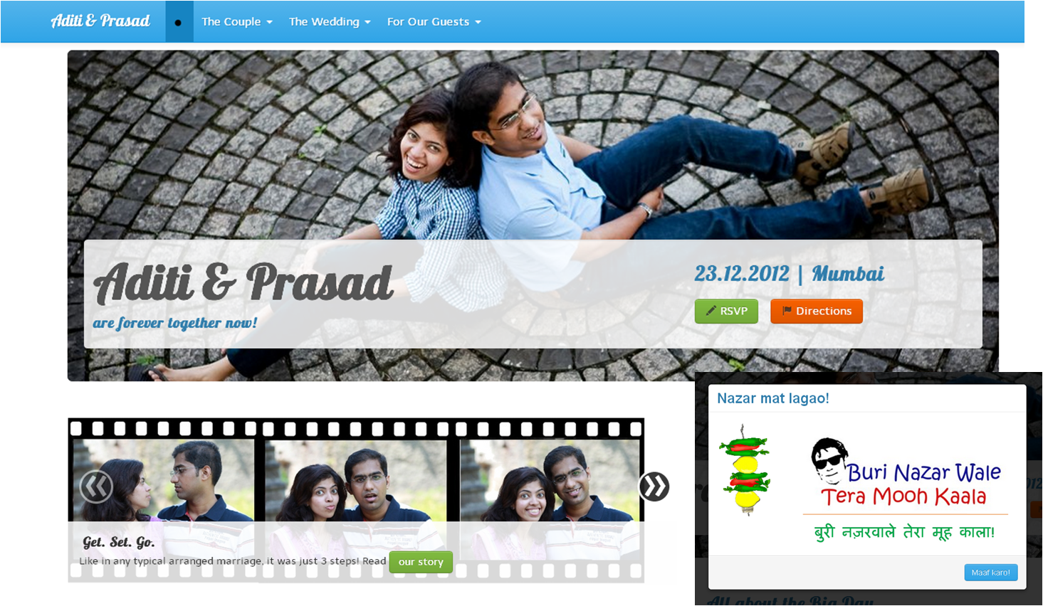
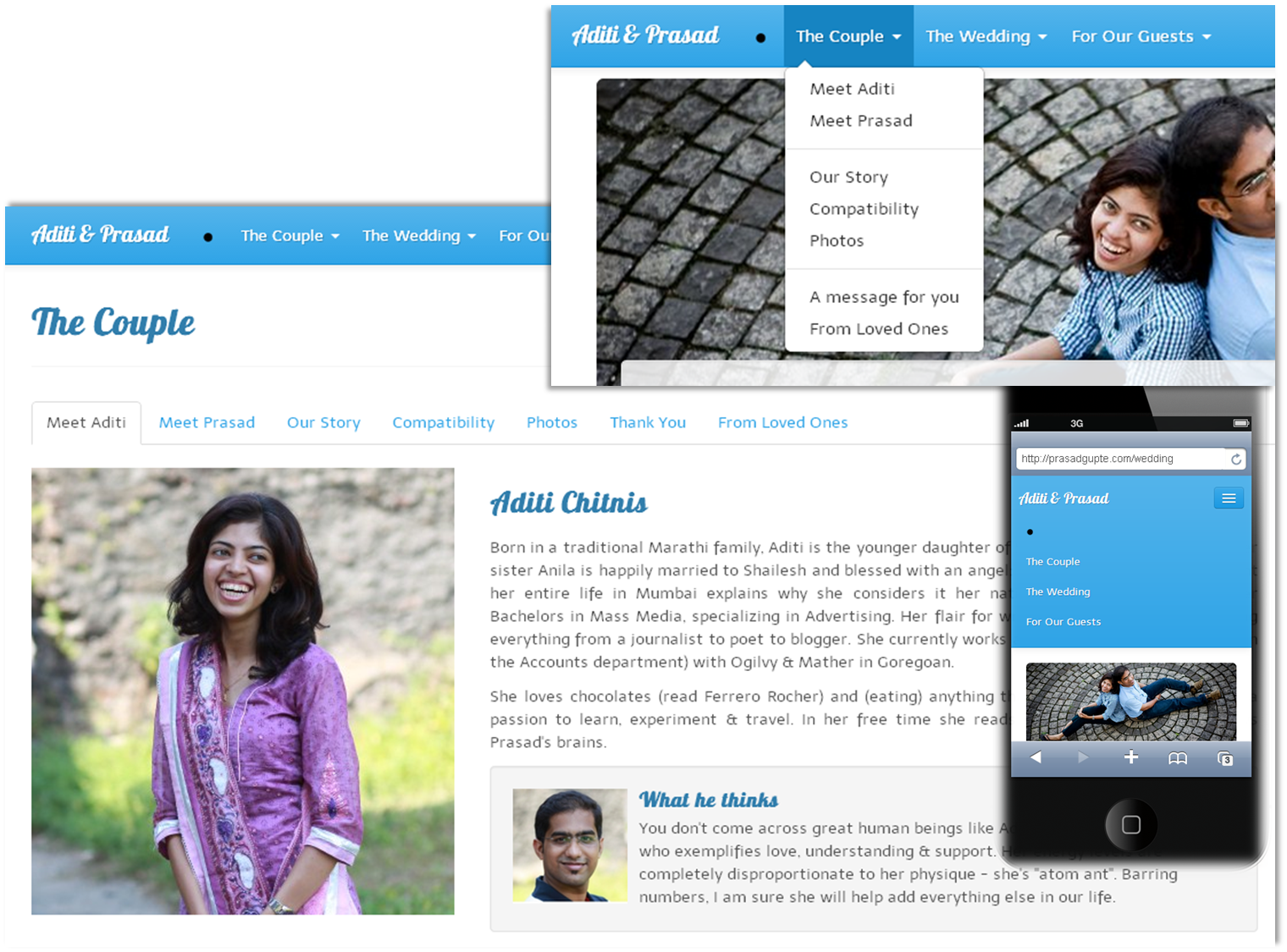
With an arsenal of ready components & scripts, the learning curve for Bootstrap was almost flat. The hashchange plugin afforded fewer pages (=fewer refreshes = little waiting for the user) and allowed us to group similar content through tabs. With Bootstrap’s fluid layout, the wedsite worked like a charm on mobile devices (with graceful degradation where it couldn’t handle the jazz).
While our parents invested in traditional invitation cards, we created our own brief for a Funky Card, and Namrata did a fantastic job visualizing it. It was downloaded more times than the traditional invites.

We re-used these graphics to build content for the wedsite…

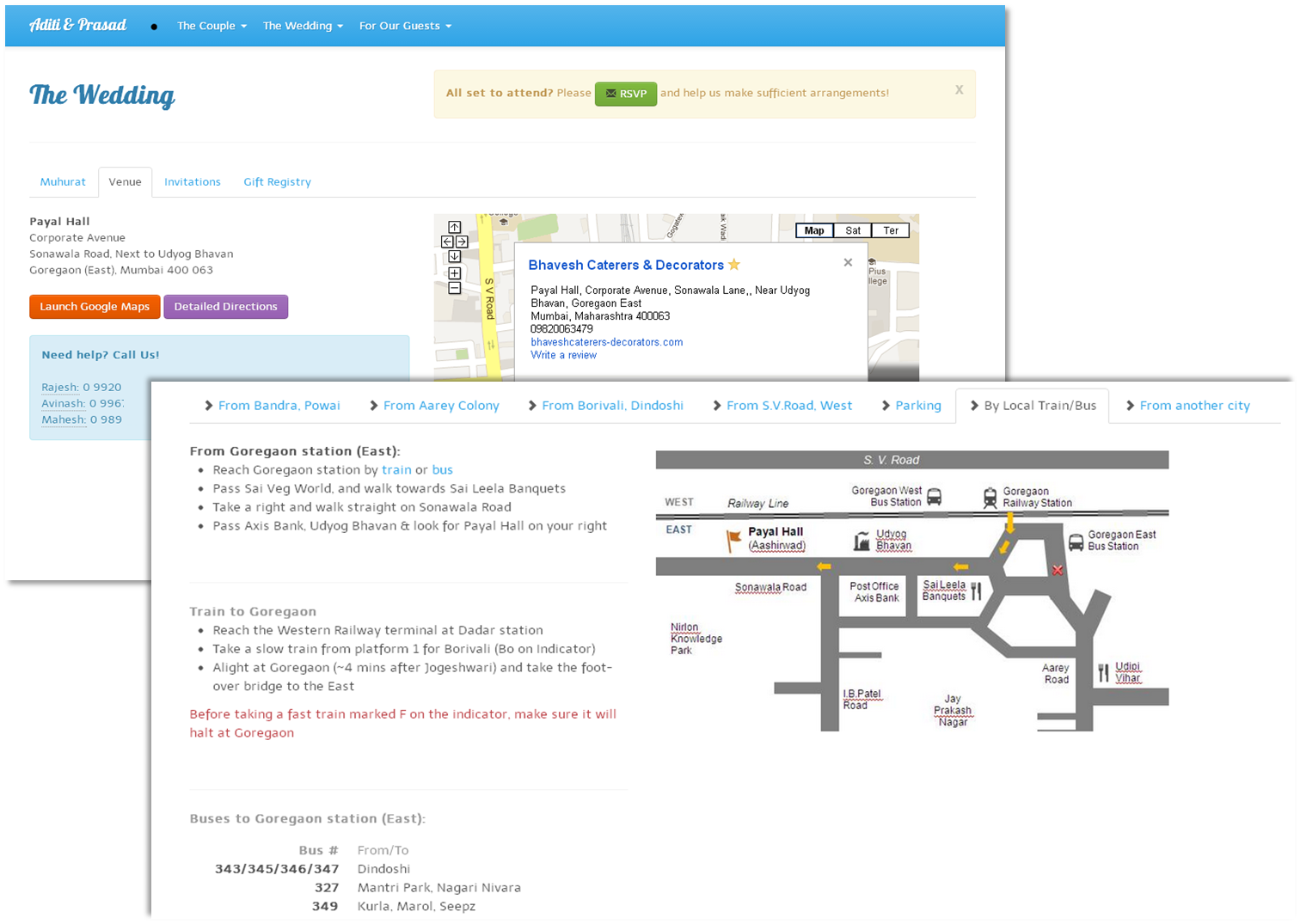
We really wanted everyone to attend and hence picked a Sunday, and a venue close to the railway station. But since it was going to be close to Christmas, we wanted to get an near accurate guest count as many would’ve planned vacation. The solution was to push the RSVP link wherever possible, prompting guests to confirm. Guests could also change their RSVP at a later time. It really helped and the variance from our original estimate was less than 1% avoiding the usual wastage of food at weddings.

We created maps for every mode of transport in every possible direction, with emergency numbers of those familiar with roads. A printed version was included with the printed invites making sure no one was lost.
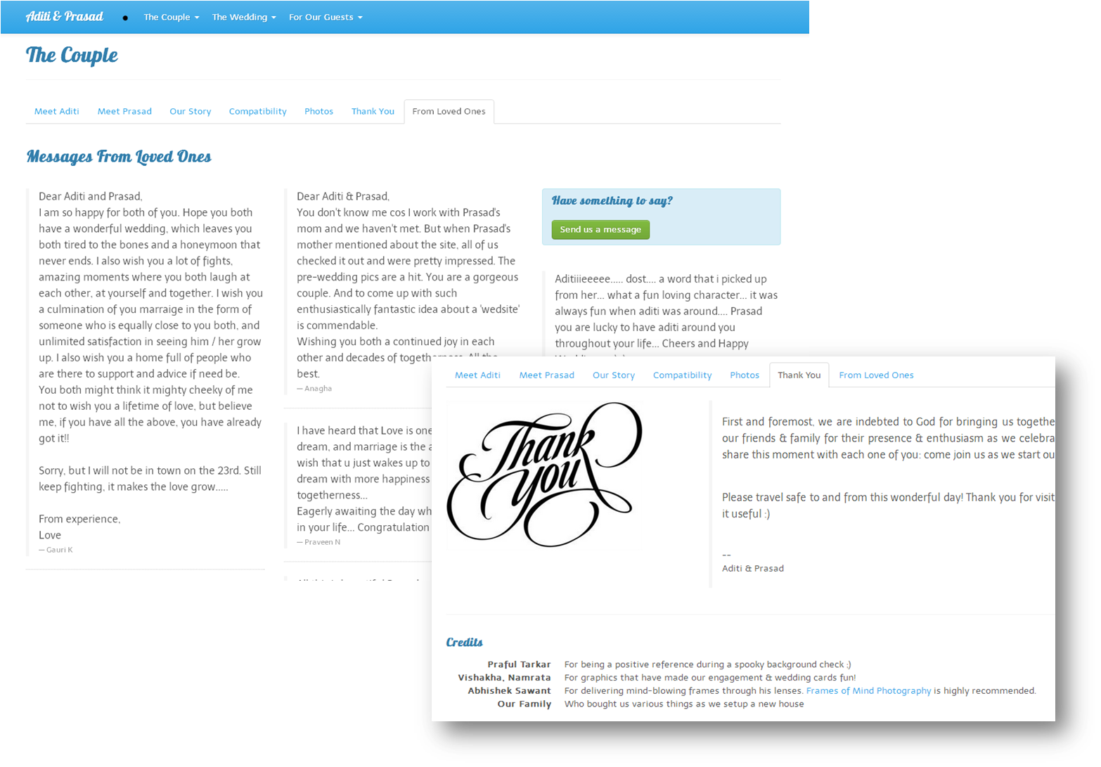
Guests could send us messages, and a chosen few were added back to the Wedsite. We also took the opportunity to thank those who had helped us get here.
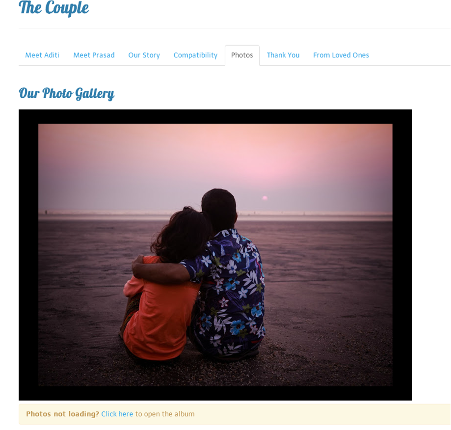
I did not want to re-invent the wheel by developing a photo-gallery. I am anyway a huge fan of Picasa (now Google Photos) and embedded the gallery in here. While the wedsite was mobile friendly, the gallery would still not render with lack of Flash support on mobiles and hence the link at the bottom.
Influenced by the MailChimp template, we created a custom invitation template that sent individual email to every guest, allowing us to include RSVP links, track delivery and send follow-up reminders.

Every RSVP generated an email notification to either Aditi or me, with a copy to the guest so they could use the same link to change their RSVP.

We created a Facebook page and kept posting there all through December. The overall engagement was fun & crucial for the massive turnout.

If you’re planning to build your own Wedsite or an app around it, and need help or advice, please do not hesitate to reach out.