Following, appreciating & criticizing change is so important in this fast moving world. Changes, especially those to internet products, is what Product managers should be keen about. One should spend time understanding 3 aspects about any product: changes, what’s good & what’s not. When it comes to internet banking, there are a ton of players out there and I know that you can’t get a sneak peak into all. And looking over the shoulder when someone’s using Net Banking is criminal. But you can always ask your friends for a tour of internet banking account (what are friends for?) with greater focus on features & design, and lesser on the numbers $$$!
Anyway, the point is that I’ve had the chance to look at quite a few online banking portals, of which AXIS stood out and had something to be written about. Somewhere around Diwali last year, AXIS Bank introduced a great new feature called NetSecure that ties your account to a computer via a special password (over and above your login & transaction passwords) which has remained unmatched. In December, they revamped their internet banking website which was otherwise constant since the UTI Bank era (Until mid 2007 AXIS Bank was called UTI or Unit Trust of India Bank). Trust me, when compared to a host of competitors (see below), this portal is a unique blend of style & a de-cluttered interface; an overall WIN in terms of the features, usability & design. Here’s what I loved, with some suggestions at the bottom.
1. A clean header that is in line with the branding (unlike the ICICI website that can be confused with the RSS portal). Another bank with excellent, consistent branding is Saraswat Bank: pleasant colors that looks great everywhere: from leaflets to hoardings to their website.

2. The landing page shows a neat summary of all your accounts along with a clear sub-navigation menu and related options on the left panel.

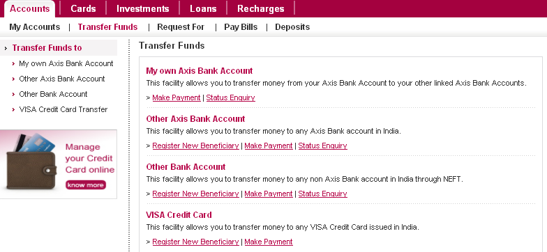
3. Options related to Funds Transfer have never been this clear.

4. The depiction of the funds transfer process crisp & clear.

5. Every bank penalizes account holders that do not maintain a average quarterly balance, but no one conveys this information to patrons and neither can it be computed at home. This feature is a clear differentiator; such transparency enhances trust & adds to loyalty.
Suggestions:
1. The landing page can be a richer source of information when turned into a consolidated dashboard with data from various services:
- Summary of savings, current and deposit accounts
- For linked credit cards, the current unbilled amount, current due amount with due date
- For linked DEMAT account, a brief summary of the portfolio & current valuation
- Utility bills that are due or have been paid automatically via ECS
- Loan installments due
2. There should be a provision to schedule NEFT transactions (Vijaya Bank has this). Ability to create a recurring transaction (weekly, monthly, quarterly) until an end date would be great value.
3. The Logout button seems a bit out of theme. The ‘Welcome User & Last Visited’ summary can be moved to the right and the logout button can be moved down. Removing the gray border around the summary will remove the ‘banded’ effect at the top.
4. A SMS reminder at the end of the first two months of the quarter when the projected average quarterly balance is low enough to be penalized.
5. The credit card sub-menu is simple enough, but with multiple credit cards it might affect usability.
6. Performance has been the one major drawback for AXIS. I found ICICI & HDFC much faster.
PS:
- This is not a paid review. I’m not that honored yet 🙁
- Comparision includes, if not for more, AXIS Bank, ICICI Bank, CitiBank, HDFC Bank, Standard Chartered, Vijaya Bank, Saraswat Bank. I do not have accounts everywhere, and anyways, there exists no direct proportion between the number of bank accounts & a person’s savings 😉
