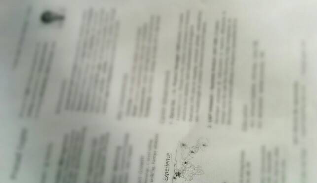
The last time I redesigned (not updated) my resume was 2009. Since then, my understanding of ease-of-use, information architecture & win-loss has grown several fold. Late last year I realized that my resume looks archaic and needs a revamp.
The need was to create something that was:
- information rich yet not cluttered
- comprehensible yet not funky
- likely to get past through the recruiter’s clutter.
Several opinions & tweaks later, I finally published a release candidate that I wanted to share. Yes, sharing definitely looses the competitive advantage at a PM opening, but what use is creativity that’s kept to yourself. I hope this bit on the design rationale helps all.
📰 The importance of Page 1

It’s a no-brainer how crucial the first page is to recruiters, considering their daily swim in the resume swarm. The key was to summarize everything that mattered to them on Page 1, while deferring details to following pages. More importantly, it also acts as a printable summary to save some paper.
7 bits of information to make Page 1 great 🏆
- Objective: Instead of something that over-promises & sounds rubbish, I jotted down my goal and acceptance criteria for my next gig.
- Photo: Not Facebook stuff with friends at a fancy location, but a close-up with clear background (like you’d use for a visa) to help the recruiter visualize who they’re talking to.
- Skills: Don’t use this to mention the courses you took at college. If C++ skills don’t matter to the role you’re applying, drop it. If possible, group skills by functional area and highlight them on a side-bar.
- Experience: Summarize experience through key outcomes you drove. Explain the impact for your business or customers. Be mindful about not revealing sensitive information. If you’ve held multiple positions at the same company, mention the last one. If you’ve worked at too many companies, mention the last 2 or 3, with total years in the side-bar.
- Education: High-school & college grades never seem to be ignored and must get a brief mention.
- About Me: This section need not be as long as it used to be on your freshman resume, but use it to reflect your attitude rather than just talk about hobbies. Everyone knows what 32/M/Married means 🙂
- Footer: One cannot over-emphasize real estate in 2014: I used the footer to create a call-to-action by using it for my contact information
🗜 Don’t forget the ‘minified’ version!
Realize that everyone is mobile these days, and if not for head-hunters, the decision makers of a senior profile surely are going to read this on their iPads or Blackberries. Moreover, LinkedIn puts a 200 Kb limit when attaching a CV to a job application. That brought to me the idea of ‘minify-ing’ my CV with a link to download the more detailed version.
✅ Resume ready. What next?
With a great resume, you’re 25% through to your next job. Next up is identifying the right opportunity. If you’re seeking opportunities in a foreign country, here are some tips to find expat jobs. Don’t let intuition decide. Think about the 8 key factors that shape your career, long-term.
